adryft
Creating conceptual screens to enhance guests' in-boat experience on autonomous water taxis.


Client
Lyft
Context
Hypothetical Case Study
Role
UX Designer
Time Frame
3 weeks
Tools
Figma, Whimsical
Team
Individual
— CONTEXT
What is adryft?
In partnership with MIT's Roboat, Lyft is (hypothetically) creating new autonomous water taxis, which are codenamed adryft. As of now, adryft will operate in select markets where canals are in primary means of transportation (e.g. Amsterdam, Venice). However, they need a conceptual UI design for the in-boat experience - and that's where the heart of this design challenge lies.
How can I design an intuitive interface to enhance the in-boat experience of adryft's autonomous water taxi for riders?
— IDEATION
What will this interface consist of?
After my research of the adryft brand identity, customer base, requirements, and goals, I determined a list of 10 functional capabilities. Features were strategically selected with the goal of being intuitive, functional, and providing users delight.
List of Functional Capabilities
-
Provide operational instructions, specifically a safety briefing
-
Highlight landmarks during transit
-
Starting point, current location point, destination point
-
Landmark pop-ups when nearby
-
-
Display trip parameters
-
Starting and destination address, distance, estimated arrival time, time remaining, speed
-
Enable destination change
-
-
Real-time boat view and under-water view
-
Immediately declare and contact adryft in the case of an emergency
-
Stop the boat option
-
Emergency video call option
-
Emergency hotline option
-
-
Use Google Voice Assistant to interact with the boat
-
Adjust screen display settings
-
Adjust in-boat climate settings
-
Play music from sources such as Spotify or Apple Music
-
Quick reference to FAQ for help and guides
— PRODUCT FLOW
What will this interface flow?
I created a product flow to map out all the screens of the interface, showing how users will be able to navigate the interface and which features will be present on each screen.
.png)
— WIREFRAMES
Ideating wireframes
With my functional capabilities and product flow, I began creating my wireframes on Figma.


— VISUAL DESIGN
Deciding on the visual design direction
In order to determine the direction of the visual design, I created three mood boards to explore different color palettes, design flourishes, feelings evoked, and avenues of adryft's brand identity.


I selected the “Playful & Inviting” mood board as the basis for the interface’s visual design, for I believe it best represents adryft’s modern, yet playful and light-hearted brand identity. When users are on adryft’s autonomous boats, they are on an adventure. The bright colors and use of rounded edges and shadows that characterize this mood board’s visual design emphasize a sense of fun and excitement. Illustrations are utilized in order to convey the playful feel of the interface, while adding personality. The overall color palette of the interface design that is consistently used revolves around adryft’s signature orange as the primary, CTA color, as well as purple and mint as secondary colors—this color palette reflects the common colors of the “Playful & Inviting” mood board.
— HIGH-FIDELITY MOCKUPS
Original mockups
After picking my mood board, I dove straight into applying the visual design to my wireframes. These are my first drafts, but keep scrolling to learn the design choices that went behind each screen, information hierarchy, and visual design decisions on my iterated, final version of my mockups!


Final high-fidelity mockups
The information hierarchy of the adryft interface screens emphasizes ease of navigation, intuitiveness, and flexibility. The home screen is structured in a dashboard style that displays an overview of information and enables users to quickly access information on other screens through the implementation of shortcut buttons. My goal for the home screen was to create a clear and organized information hierarchy that balances displaying a fair amount of information while still being readable and clear. Furthermore, in order to ensure that users are able to access the different screens from any point in the interface, a navigation menu is implemented on the right side of the screen. In order to avoid clutter, the navigation menu is hidden until users manually click on the hamburger button icon located on the bottom right. Although users are able to access shortcuts from the home screen, this navigation menu will be beneficial for users when they are on one screen and want to jump to another screen—a functionality that promotes flexibility.
This interface was designed with both first-time and returning users in mind. Given that there are risks that are associated with an in-boat experience and in order to accommodate for first-time autonomous boat riders, safety is a top priority. Users must interact with a series of operational instructions and a safety briefing before proceeding into the main interface screens. Additionally, an emergency button, with three help options, is accessible on the bottom left of every main UI screen.
Iteration was also key for the visual design. I asked prospective users about what feelings the UI elicited, and after receiving feedback on the color treatment of my original high-fidelity mockups, I changed the short cut buttons on the home screen to purple, which the users I surveyed preferred.
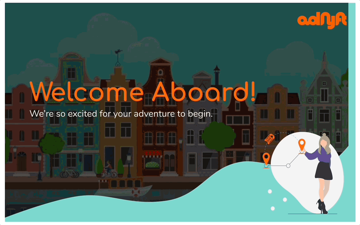

Figure 1 – Landing
As the first screen that users interact with, this screen warmly welcomes the user and invites them on their trip. The use of illustrations helps to convey a light-hearted and whimsical feel.
Figure 2 – Confirmation
In order for the system to recognize the user and pinpoint their trip details, the user must enter their confirmation code. The primary color used is adryft’s signature orange, paired with mint and purple.


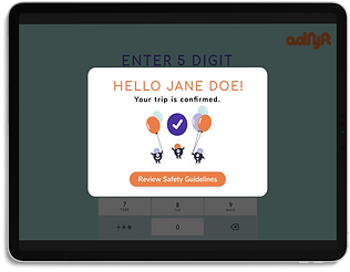
Figure 3 – Confirmation Success
The system relays to the user that they successfully confirmed their trip. Illustrations are again utilized in order to emphasize the brand's playful and fun feel.
Figure 4 – Safety Instructions
To ensure that users are aware of the safety measures put in place while on the autonomous water taxi, users must interact with a series of operational instructions. A carousel slideshow is utilized to increase interactivity on this screen.


Figure 5 – Home (Street Map View)
Structured in a dashboard style, the home screen displays an overview of information and enables users to quickly access information on other screens.
My goal was to create a clear and organized information hierarchy that balances displaying a fair amount of information while still being readable. Orange highlights important information, such as selected button choices and trip parameters. The shortcut buttons are in purple in order to visually differentiate them from the other sections of the dashboard and enable greater accessibility.
Figure 6 – Home Screen (Satellite Map View)
Users have the ability to easily switch between a flat map view and a satellite view, zoom in and out of the map, and connect with Google Assistant.


Figure 7 – Home (Nearby Landmark Functionality)
As users travel near a renowned landmark, a brief blurb of information pops up. Users have the option to immediately “X” out of this pop-up if they are not interested.
Figure 8 – Home (Hamburger Navigation Bar View)
In order to avoid clutter, this navigation menu is hidden until users manually click on the hamburger button icon located on the bottom right. This navbar can be seamlessly accessed from any screen and can directly take users to the screen they would like to visit.


Figure 9 – Home (Emergency Button View)
This screen displays the menu of options when the Emergency button is clicked.
Figure 10 – Emergency Hotline Waiting
When users click on the “Emergency Hotline,” a pop-up appears indicating a call to an adryft operator. Animation is used on the call icon in order to provide visual feedback for waiting users.
